
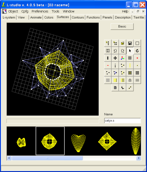
The surface, contour, function, and panel editors share a user interface paradigm: the gallery. At the top left of the editor window is the preview; to its right are all of the controls for altering it. Below the preview and controls is the gallery. This is a window which shows all of the surfaces, contours, functions, or panels (respectively) which are part of the object.
The gallery lets you see all of the components of a particular type which are part of the object. Clicking on one will bring it up in the preview window, where it can be altered with the editing controls. Right-clicking on the preview window brings up a popup menu which includes the commands:
Each component has a name; a new component's name is "unnamed".
Right-clicking in the gallery brings up the gallery popup menu, which includes the commands:
You can also move a gallery entry by selecting it, then dragging it to a new position.
Each panel in the gallery is saved to a file name.pnl on the lab table, where name is the name given to the panel. Panels called "unnamed", however, are not saved. This is also the default behaviour for surfaces (which are saved as name.s) and contours (name.con). However, surfaces, contours, and functions can be bound into sets, which are saved as single files.
The gallery popup menu of the surface, contour, and function editors has an extra command. Bind toggles the state of the components: if on, they are bound to a set; if off, they will be saved as individual files. Note that if the components have been saved as individual files, then are bound, the individual files will not be deleted; similarly, if they are unbound, the set will not be deleted.
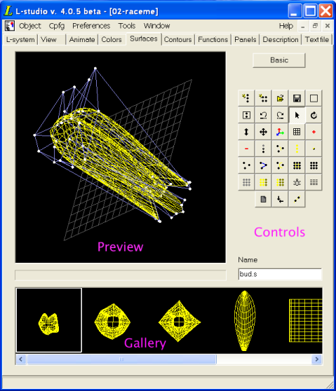
Surfaces in L-studio are implemented as Bezier patches. There are two surface editors available: the basic surface editor, and the advanced editor. With the basic editor, you can edit and manipulate surfaces with a single Bezier patch. Surfaces made from more than one Bezier patch must be edited using the advanced editor. To switch between the basic and advanced editors, press the Advanced or Basic button in the top right corner of the editor.
For more information about surfaces in cpfg, see the Cpfg User's Manual. More information can also be found at http://www.cpsc.ucalgary.ca/Research/bmv/vlab/ise.html.
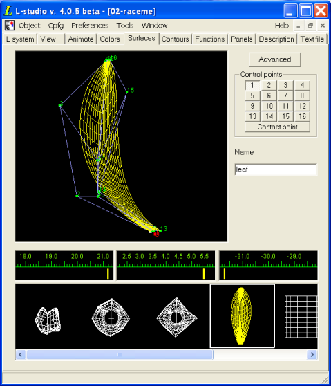
In the top left of the editor is the preview window, which shows the current state of the surface currently being edited. To the right of the preview window are the controls: the Advanced button switches to the advanced surface editor; below it is an array of buttons to select which Bezier patch control point is currently being edited; and below that is the name of the current surface. Under the preview window and controls are three sliders which display (and can be used to set) the X, Y, and Z position of the currently selected control point. At the bottom of the editor is the gallery of surfaces. If a gallery entry is in white, it was created with the advanced editor, and cannot be loaded into the basic editor; attempting to select such an entry will merely display a message in the preview window indicating this.
The preview window can be in one of two modes:
The default mode is Rotate. To enter Lock XY mode, right-click on the preview window and select Lock XY Design from the popup menu. To return to Rotate mode, select Lock XY Design again.
In Rotate mode, you can rotate the view of the surface by dragging on the preview window with the mouse. To reset the display to its default parallel projection, right-click on the preview window and select Reset rotation from the popup menu. In Lock XY mode, the surface cannot be rotated: it is presented in parallel projection on the X–Y plane.
You can pan and zoom the preview window. In both modes, pan by dragging the mouse while holding the Shift key on the keyboard. To zoom in or out, either drag with the middle mouse button, or drag with the left mouse button while holding the Ctrl key on the keyboard. Dragging the mouse up zooms in, while dragging down zooms out.
You can choose to display or not display the control mesh, the control points, or the control points' numbers. You can also show the surface in one of three densities of wireframe, or as a shaded surface. These options are chosen through the Display submenu of the preview window's popup menu.
The surface can be edited in both modes. In Rotate mode, select a control point using the buttons labeled 1–16. The three sliders located below the preview window can be used to change the X, Y and Z coordinates of the selected point. In Lock XY mode, a control point can be edited directly by clicking to selct it, then dragging it. (Note that in Lock XY mode, you can only drag a control point within the X–Y plane; to change its Z coordinate, select it and use the Z slider.)
You can also change the contact point associated with the surface. When cpfg/lpfg draws the surface, the turtle position corresponds to the contact point. See the Cpfg User's Manual for more information.
If you choose the command Keep symmetric from the popup menu, any change you make to a control point's position will be mirrored in point opposite it in the plane defined by the Heading and Up vectors. The result of applying Keep symmetric to a surface which is not symmetric to start with is undefined.
Again, the preview window is at the top left, the controls are to its right, and the gallery is at the bottom. The Basic button, at the top left, switches back to the basic surface editor. The button panel below it offers many controls for editing the surface:
 Init B-spline clears the current
surface and creates a new B-spline curve.
Init B-spline clears the current
surface and creates a new B-spline curve. Init Bz-Surface clears
the current surface and creates a new surface.
Init Bz-Surface clears
the current surface and creates a new surface. Open opens a dialog box which lets you chose a
file to open as the current surface.
Open opens a dialog box which lets you chose a
file to open as the current surface. Save lets you save the current surface to a
file.
Save lets you save the current surface to a
file. Init view resets the view in the
preview window. The view is set to look down on the X–Y plane,
and the pan and scaling is set so that the entire surface can be
seen.
Init view resets the view in the
preview window. The view is set to look down on the X–Y plane,
and the pan and scaling is set so that the entire surface can be
seen. Fit view adjusts pan and scaling so
that the entire surface can be seen in the preview window.
Fit view adjusts pan and scaling so
that the entire surface can be seen in the preview window. Undo undoes the last change you made to the
surface. You can undo more than once.
Undo undoes the last change you made to the
surface. You can undo more than once. Redo redoes an operation you just undid with Undo.
 Select switches the editor into Select mode. In this mode, you can select control
points by left-clicking them. A selected control point offers three
handles: dragging the red handle moves the point in the X dimension,
dragging the green handle moves the point in the Y dimension, and
dragging the blue handle moves the point in the Z dimension. While in
Select mode, dragging the mouse while holding
Alt rotates the view.
Select switches the editor into Select mode. In this mode, you can select control
points by left-clicking them. A selected control point offers three
handles: dragging the red handle moves the point in the X dimension,
dragging the green handle moves the point in the Y dimension, and
dragging the blue handle moves the point in the Z dimension. While in
Select mode, dragging the mouse while holding
Alt rotates the view. Rotate switches the editor into Rotate mode. In this mode, you can drag the mouse on
the preview window to rotate the view of the surface.
Rotate switches the editor into Rotate mode. In this mode, you can drag the mouse on
the preview window to rotate the view of the surface. Zoom switches the editor into Zoom mode. In this mode, dragging the mouse up in
the preview window zooms in on the surface, while dragging down zooms
out.
Zoom switches the editor into Zoom mode. In this mode, dragging the mouse up in
the preview window zooms in on the surface, while dragging down zooms
out. Translate switches the editor
into Translate mode. In this mode, you can pan
the view of the surface by dragging the mouse in the preview
window.
Translate switches the editor
into Translate mode. In this mode, you can pan
the view of the surface by dragging the mouse in the preview
window. Axes toggles the display of the Cartesian axes.
The red arrow points along the positive X axis, the green arrow points
along the positive Y axis, and the blue arrow points along the
positive Z axis.
Axes toggles the display of the Cartesian axes.
The red arrow points along the positive X axis, the green arrow points
along the positive Y axis, and the blue arrow points along the
positive Z axis. Grid opens a submenu which lets you choose which
grids you want to display. You can independently turn on or off the
X–Y grid, the Y–Z grid, and the X–Z grid. Choosing
Grid from the submenu toggles all active grids
on or off.
Grid opens a submenu which lets you choose which
grids you want to display. You can independently turn on or off the
X–Y grid, the Y–Z grid, and the X–Z grid. Choosing
Grid from the submenu toggles all active grids
on or off. Insert brings up a submenu offering three
options:
Insert brings up a submenu offering three
options:
 Delete brings up a submenu with three options:
 Multiplicity opens a
submenu from which you can choose the multiplicity of the currently
selected control point.
Multiplicity opens a
submenu from which you can choose the multiplicity of the currently
selected control point. Type brings up a submenu which lets you
change the type of the curve containing the currently selected
control vertex. You can change it to a bezier patch, or any
of several types of B-spline.
Type brings up a submenu which lets you
change the type of the curve containing the currently selected
control vertex. You can change it to a bezier patch, or any
of several types of B-spline. Select opens a submenu which lets you select
every control point, including control points of variations; all
control points on the currently selected curve or surface; or a single
one of the currently selected control points. This last option is
useful if there are several control points close together, and
distinguishing them graphically is difficult.
Select opens a submenu which lets you select
every control point, including control points of variations; all
control points on the currently selected curve or surface; or a single
one of the currently selected control points. This last option is
useful if there are several control points close together, and
distinguishing them graphically is difficult. Align moves all currently selected control
points to the position of the active control point — that is,
the control point currently displaying directional arrows.
Align moves all currently selected control
points to the position of the active control point — that is,
the control point currently displaying directional arrows. Display Points toggles whether
control points are displayed in the preview window.
Display Points toggles whether
control points are displayed in the preview window. Display Polygon toggles whether
control polygons are displayed in the preview window.
Display Polygon toggles whether
control polygons are displayed in the preview window. Display Curve toggles whether curves
and surfaces are displayed in the preview window.
Display Curve toggles whether curves
and surfaces are displayed in the preview window. Divide subdivides the curve or surface which
contains the currently selected point.
Divide subdivides the curve or surface which
contains the currently selected point. Show selects which portions of the surface
to show on the display. It opens a submenu from which you can choose
All, to show the entire surface and all of
its components;
Curve, to show only the currently selected
curve or surface;
Patch, to show only the currently selected patch
of curve or surface;
and Point, to show only the currently selected
control points.
Show selects which portions of the surface
to show on the display. It opens a submenu from which you can choose
All, to show the entire surface and all of
its components;
Curve, to show only the currently selected
curve or surface;
Patch, to show only the currently selected patch
of curve or surface;
and Point, to show only the currently selected
control points. Hide brings up a submenu which lets you
hide the current surface, the currently selected patch, or the
currently selected control points. Hidden components cannot be
selected with the mouse.
Hide brings up a submenu which lets you
hide the current surface, the currently selected patch, or the
currently selected control points. Hidden components cannot be
selected with the mouse. Brighten opens a submenu which lets you
brighten the entire surface and all of its components, or just the
currently selected surface, patch, or control point.
Brighten opens a submenu which lets you
brighten the entire surface and all of its components, or just the
currently selected surface, patch, or control point. Darken brings up a submenu which lets you
darken the current surface, the currently selected patch, or the
currently selected control points. Darkened components can still be
selected with the mouse.
Darken brings up a submenu which lets you
darken the current surface, the currently selected patch, or the
currently selected control points. Darkened components can still be
selected with the mouse. Turtle opens a dialog box in which you
can specify the surface's contact point, end point, heading vector,
up vector, and initial size. These parameters are described in
the Cpfg User's Manual.
Turtle opens a dialog box in which you
can specify the surface's contact point, end point, heading vector,
up vector, and initial size. These parameters are described in
the Cpfg User's Manual.
Transform opens a dialog box in which you can specify various transformations to directly apply to the currently selected control points.
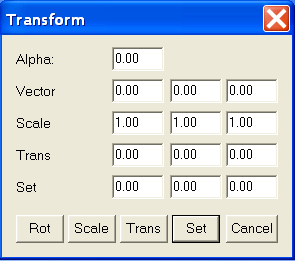
To rotate an angle α about a vector v, enter α in degrees in the Alpha box, and the components of v as Vector, then press the Rot button. To scale from the origin, enter the scaling factors along the X, Y, and Z axes as Scale, then press the Scale button. To translate, enter the X, Y, and Z offsets as Trans, then press the Trans button. Finally, you can directly set the coordinates; enter them in the Set fields, then press the Set button.
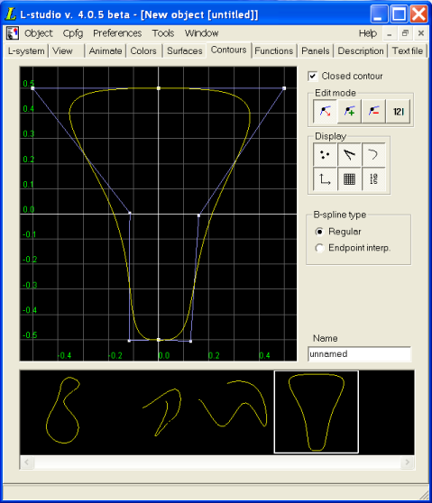
Contours in L-studio are defined by B-spline curves. The contour editor lets you manipulate the curve's control points; you can add or delete control points, move them, or change their multiplicity (strength of attraction). You can also select between several types of B-spline curve.
L-studio lets you create contours which are closed or open; to switch between them, check or uncheck the Closed contour check box, in the top right corner of the editor. In addition, you can force the B-spline to pass through the first and last control points by selecting Endpoint interp. in the B-spline type group; the normal, non-interpolating behaviour is selected with the Regular button.
Points can be manipulated in one of four edit modes. The current edit mode is selected using the buttons at the top right. The available modes are move points, add points, delete points, and set coordinates.
You can toggle the display of the control points, the control polygon, the edited curve, the coordinate system axes, the grid and the labels on the grid using buttons grouped in the Display section.
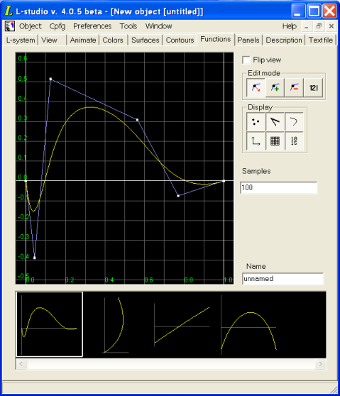
The function editor is very similar to the contour editor. The objects being edited are also cubic spline contours, but have some additional constraints:
These conditions assure that the curve can be interpreted as a function of X.
Points can be manipulated in one of four edit modes. The current edit mode is selected using the buttons at the top right. The available modes are move points, add points, delete points, and set coordinates.
In move points mode, you can drag a control point to a new position. The X coordinate of the point will always be held between the X coordinates of its neighbours.
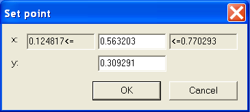
Finally, in set coordinates mode, clicking on a control point lets you explicitly set its X and Y coordinates. The Y coordinate can be set to any value, but the X coordinate must be between the X coordinates of the neighbouring points.
You can toggle the display of the control points, the control polygon, the edited function, the coordinate system axes, the grid and the labels on the grid using buttons grouped in the Display section.
The functions can be displayed in two ways. Traditionally, the domain (X) of the function y=f(x) is associated with the horizontal axis, while the range (Y) is associated with the vertical axis. In some cases, it is convenient to assume that X is the vertical axis and Y is the horizontal axis. To do this you can check the Flip view check box. Flip view is a property of a function, so it is possible to have only some of the functions flipped. This property is saved together with a function only if the gallery of functions is bound into a function set.
This is the number of samples to be precomputed by cpfg/lpfg for a function. For more information, refer to the section Function galleries in What's new in cpfg.
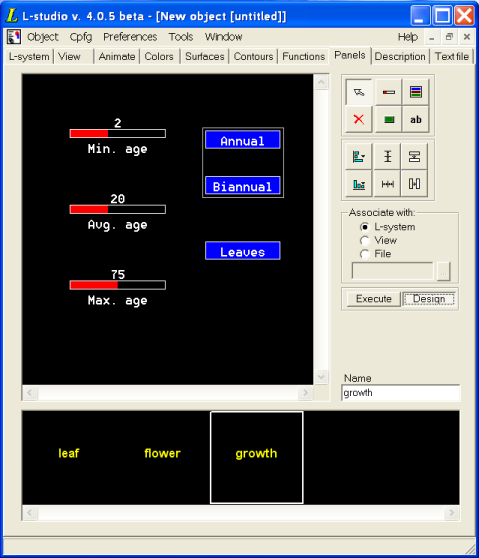
Panels are used to control parameters during experiments. An extensive description of panels can be found in the vlab panels documentation. The description provided here focuses on the user's perspective of the panels editor, as well as on the differences between vlab and L-studio implementations.
The current working mode is determined by the buttons Execute and Design. In Execute mode, the user can interactively change the displayed values; these changes are immediately applied to the relevant files on the lab table. In Design mode, the panels themselves can be modified, and the commands along the right side of the editor are accessible.
The Associate with area lets you choose which file is modified by the current panel: the L-system file, the View file, or another file (whose filename is typed in the text box).
To modify the properties of an widget, double-click on the widget. This will open the widget's Properties dialog box. Each type of widget has its own dialog box:
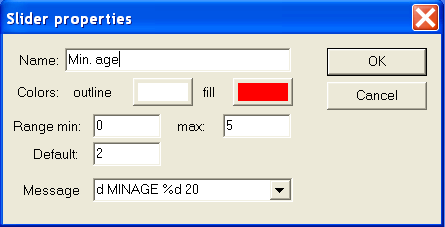
The Slider Properties dialog lets the user change the properties of slider widgets:
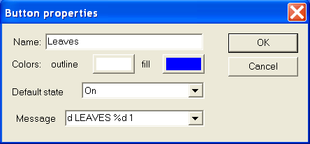
The Button Properties dialog lets the user change the properties of button widgets:
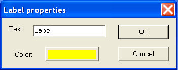
The Label Properties dialog lets the user change the properties of text labels: